You don’t need to be a genius to know that a strong brand helps drive business, just like you don’t need a design degree to understand that a strong logo helps build brand identity. But, logic in a 21st Century dynamic isn’t always straightforward. Many DJs and producers today have built a stronger brand than the labels supporting them, through community engagement across the social spectrum. However, there are standout labels today like Dirtybird, with a strong brand providing a positive context to its artist roster.
“Whether or not they actually care in a mass, general population feedback thing is not my number one concern. Not in the way that I am concerned about a piece of music.”
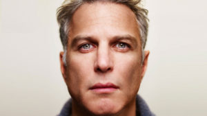
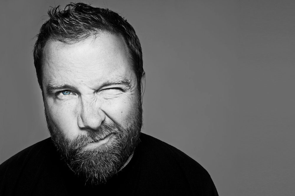
Barclay Crenshaw
Given our current world of streaming and looking at thumbnail images on our iPhone, we couldn’t help but wonder why to focus on this. So we asked the man behind it all, Mr. Claude Vonstroke.
What sorts of things catch your eye in the world?
I really like lowbrow surrealism or pop surrealism. It’s like a pop-culture version of surrealism. Like Salvador Dali, but with pop culture references. It’s like a mix of graffiti and street art; it can be highly technical or less technical depending on the artist.


What pieces of art are decorating your home?
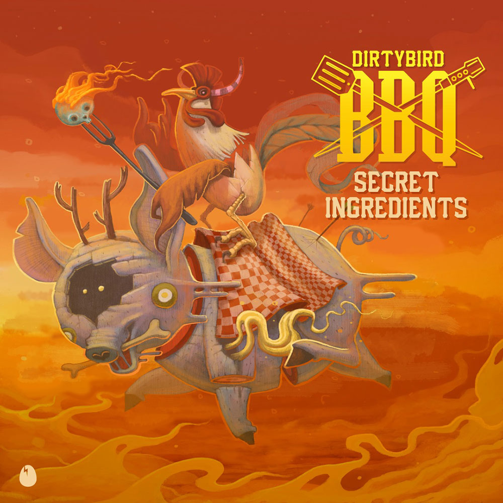
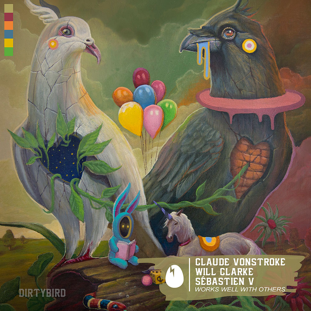
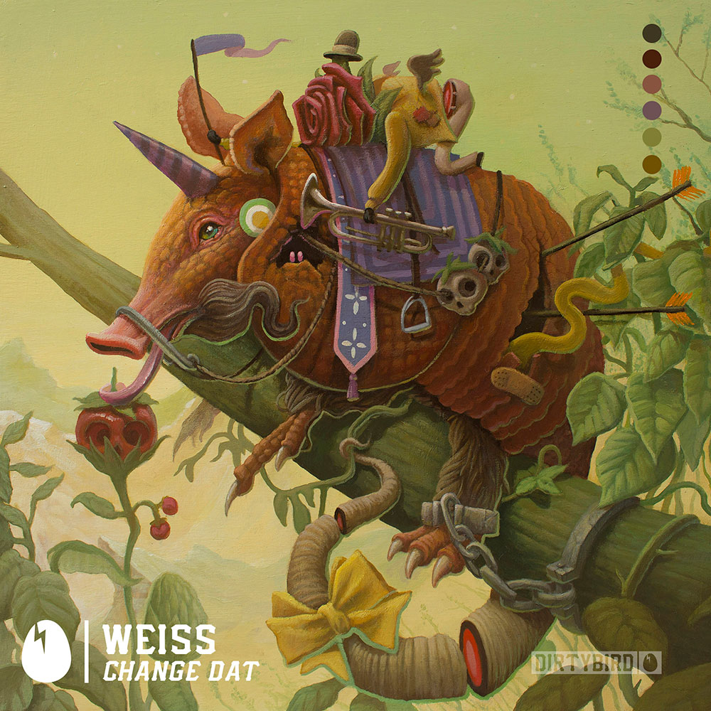
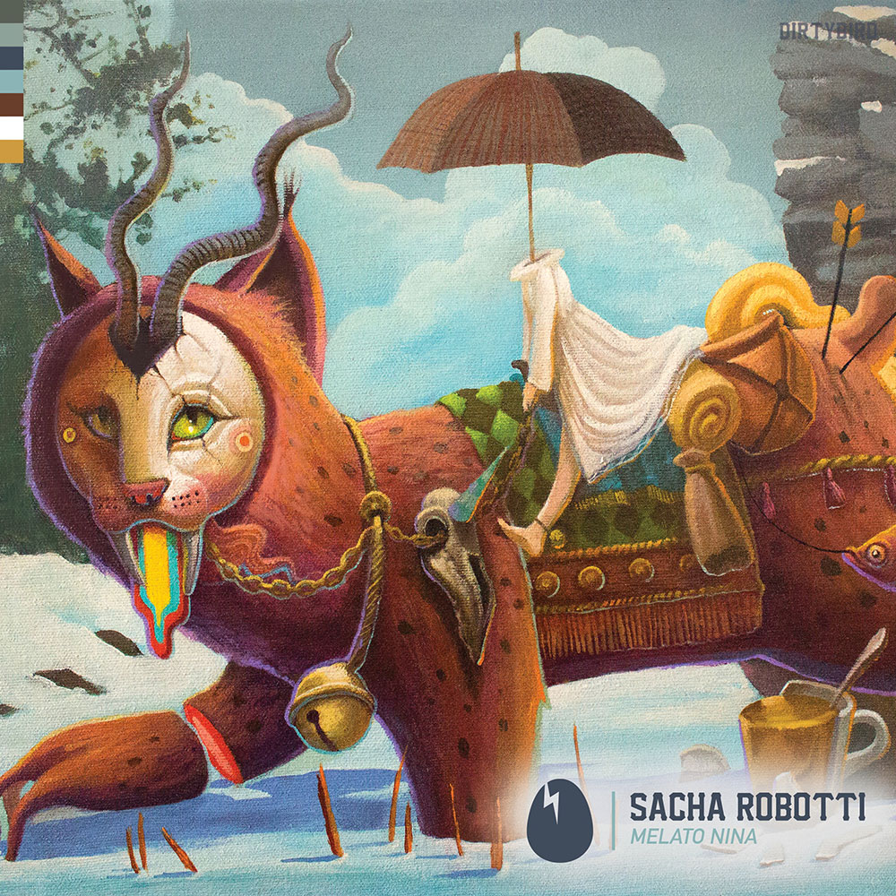
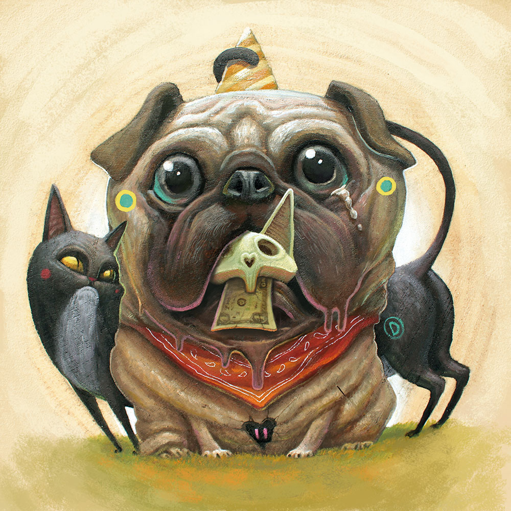
I have a bunch of different pieces. We hire a different artist every single year to do our cover art for Dirtybird and I always buy some pieces by the artist we hire. So in our home, we have roll Raoul Deleo, which was a few years ago. I have a bunch of Graham Carter pieces. Dan May paintings. I have a giant Dulk and my son has a small Dulk painting.
Do you collect pieces by artists other than those you work with?
No, because I actually pick the people that I think are the best. Well yeah, there are some people that I cannot afford; I would love a Craola and to have a Jeremy Fish piece. Jeremy Fish is kind of how this all started, looking at his art on tee shirts in Lower Haight in San Francisco and at Upper Playground. It’s how I found out about this entire genre of lowbrow surrealism.
Do you remember the first piece of cover art that made an impression on you?
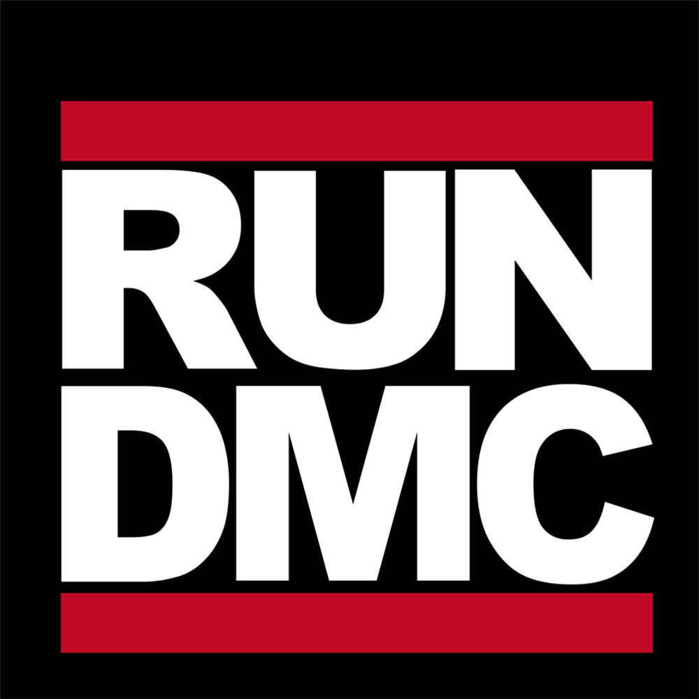
There are a few I remember when I was a little kid; the Led Zeppelin one with the giant Zeppelin crashing; the Run DMC with the giant Run DMC across the front of it; and kind of funny but the Get Luck album by Loverboy with the guy wearing red leather pants crossing his fingers over his ass. I just thought that was such a crazy cover idea. It is very bold.

Do you go to galleries while touring or during your downtime at home?
I do. I go to a lot of stuff. When I was just in Montpellier, France, I made an effort to leave my hotel and go find something. Everything was closed but I still found something. It was kind of depressing, an exhibit on Hitler’s private photographer. I also found a very small painting exhibit. And the last time I was in Chicago, I saw the Takashi Murakami exhibit at the Museum of Modern Art. It was unbelievable. That’s another one of these artists that I would love to have work by.
How do you go about choosing an artist?
I subscribed to Juxtapose and High Fructose magazines. I look online, I follow threads, I go on Instagram—I’m avidly searching for images that I think are cool. It’s very similar to how I do music. Once I find an image that I like, I look up who made it and then I backtrack and find all their pieces. From that point, I can see pretty quickly if it’s just this one piece that I like or if I just their body of work.
And then you just drop them an email and say, hi, I’m Barclay.
Yeah, pretty much. Sometimes it’s our label manager. It’s very hit or miss because I’m not aware of their level. If you were to mention DJs, I could tell you that this person is kind of at this level and that they probably make this much money. I would have an idea of what to offer them. Besides the fact that I know that Shepard Fairey is rich; I don’t know what the tiers are as much in the art world. So basically, we’ll just approach anyone.
Do you have 2019 locked down?
No, I recently had two people say no and just heard another no this morning.
And you just keep on moving on?
Dirtybird is a small record label; we don’t really have the budget. We keep moving. You have to hit that person who is still becoming famous or the ones that really like the idea of working with a record label.
Do you expect artists to do homework prior to meeting with you?
I feel like they always do the homework. Artists are kind of meticulous; they want to know what they’re doing. We always send a pack of past works so they know what we like and what they’re getting in to. We tell them the name of the track and send them music, but that’s it.
Does it matter if they’re a fan of the label and artists, or a fan of dance music in general?
There have definitely been different levels of excitement over the music by graphic artists, but in general, I think that they just look at it as a project that is fun because we don’t really tell them what to do. We don’t say, “Hey, we want to have a donkey on the moon with like cheese coming out of his nose or something.” It’s their thing; it’s their chance to interpret it however they want to. Some people are so good that they’ll send in more than one option.
Do you go through edits?
We don’t go through a lot of edits and the reason for that is because almost everyone, except for the very first year, has been a painter. So editing is not really on the table, but there are some edits that we have to make for sizing.
Speaking of size, I imagine the majority of people looking at your cover art are seeing thumbnails in iTunes or whatever streaming service. Are there best practices?
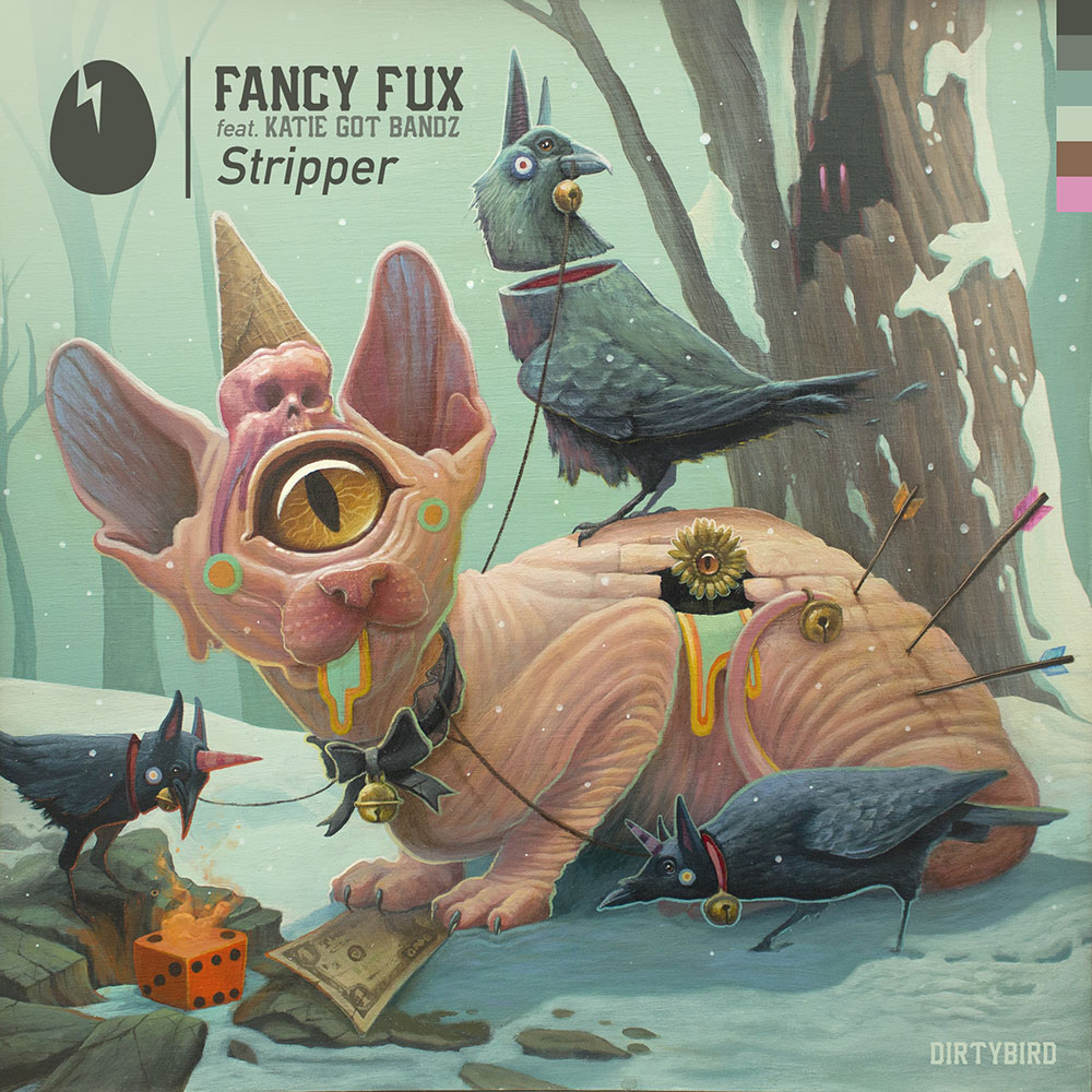
Oh yeah, but this goes back to the choosing phase. I have realized over the years that a highly technical painting with 300 different things going on is the wrong artwork for a record label. Large characters and things that have a central focus make good covers. I do also like artwork where there are a 100 things going on, but what you’re saying is true. What you see will probably be a ¼-inch on your phone; it just needs to be a face, or a monster—or a banana or something.
We’ve talked about the creative side, but what’s motivating you from a business perspective?
Business-wise this was a terrible idea. We don’t make money. Basically, I’m using my success to follow one of my hobbies. I’m busy, I don’t have much free time; I had to figure out how to get my hobbies to work inside of my business.
Are you saying that it’s not so important?
I don’t know. I think people care, but who knows? And really, I don’t care. I’m saying, I hope they care, and I hope that they notice that our artwork is way cooler and more interesting, and not just the same logo repeated over 20 different colors. It would be incredible if they did notice and took the time to look because it is amazing. But whether or not they actually care in a mass, general population feedback thing is not my number one concern. Not in the way that I am concerned about a piece of music. I’m doing this because just love the artwork; it’s an extension of my personality.
Do you think it is important for an up-and-coming artist to put focus on their visual identity?
Yes and no. It should be at least passable. I feel like there is a certain level of art for certain kinds of music that would work better or even be safer than doing a bubble font on top of the photo—or just something that’s just super bad, you know? I don’t know how to answer this question because that could also be cool in a really ironic, stupid way.
What do you see record labels doing right when it comes to creating a cohesive brand?
How about I tell you who I tried to be like when I started? I was always a fan of Ghostly and Spectral because I felt like they’ve had a very cohesive brand—everything ties in together. These guys are like two steps ahead of everyone else on a technology front and a look and feel and everything was like super tight. They’re a tight ship. I was always kind of chasing that.
Ghostly is kinda the epitome of a label that’s built on aesthetics. A lot of artists today have a stronger brand than the labels supporting them. But then you have labels like Ghostly that kind of provide this rich context to the artists on the label. It makes you more inclined to click play on something unfamiliar. I feel like Dirtybird is in this category.
Thank you. I would say that there are other labels that have that feeling as well, but I wouldn’t accredit it to the artwork. I would say that Ghostly has the branding and the artwork that made it be like that. But if you’re talking about just general brand association, I would say, Ninja Tune, Warp, Def Jam. These are labels that you’re like, “Ok, this person is on this label and I’ve never heard of this person, but because they’re on this label, I’m going to listen to it.”
Yes, exactly.
It’s very attractive as an artist to be involved with a label like that. It’s like, “if I could just get into this club, people would listen to me.” Maybe I did it on purpose without even realizing what I was doing because those were all the labels that I wanted to be on. It’s very appealing when you see someone running a really tight ship with a very clear vision. Maybe that’s what I’m trying to do to attract new talent, is to give that image.